UBS · CASE STUDY 03
Dark mode for UBS Mobile App
109
In-app dark mode requests since 2024
33%
Of UBS.com mobile visitors already browse in dark mode
72%
Expected adoption once available (industry average)
1st
Dark mode proposal at UBS to reach full approval
COMPANY
UBS
ROLE
Sole Product Designer
TIMELINE
2024 — 2025
TEAM
Mobile Foundation. Design system, iOS & Android engineering, brand, illustration
STATUS
Approved 2025. Release planned for end of 2026. Launch currently postponed.
CONTEXT
Every major competing bank had it. UBS did not.
UBS mobile users had been requesting dark mode for years. The reasons it never shipped were not lack of awareness. Capacity constraints, development complexity, and a brand built around red, one of the most technically difficult colours to carry into dark environments while maintaining accessibility compliance, had repeatedly stalled the effort. Multiple internal attempts had been made. None reached approval.
The demand was documented and substantial. Since 2024, 109 users submitted explicit dark mode requests through in app feedback. An analysis of UBS.com mobile traffic found that 33% of visitors, nearly 148,000 people, were already browsing with dark mode enabled at system level. Industry data puts expected adoption at 72% once dark mode becomes available.
Dark mode at UBS was not a trend feature. For users with visual sensitivity, or anyone banking in low light conditions, its absence was a real and recurring friction. When business finally committed it to the 2026 roadmap, the question was not whether to do it but who would solve what every previous attempt had failed to solve.
By any measure, dark mode had moved past the early adopter phase. UBS was not early to this. It was overdue.
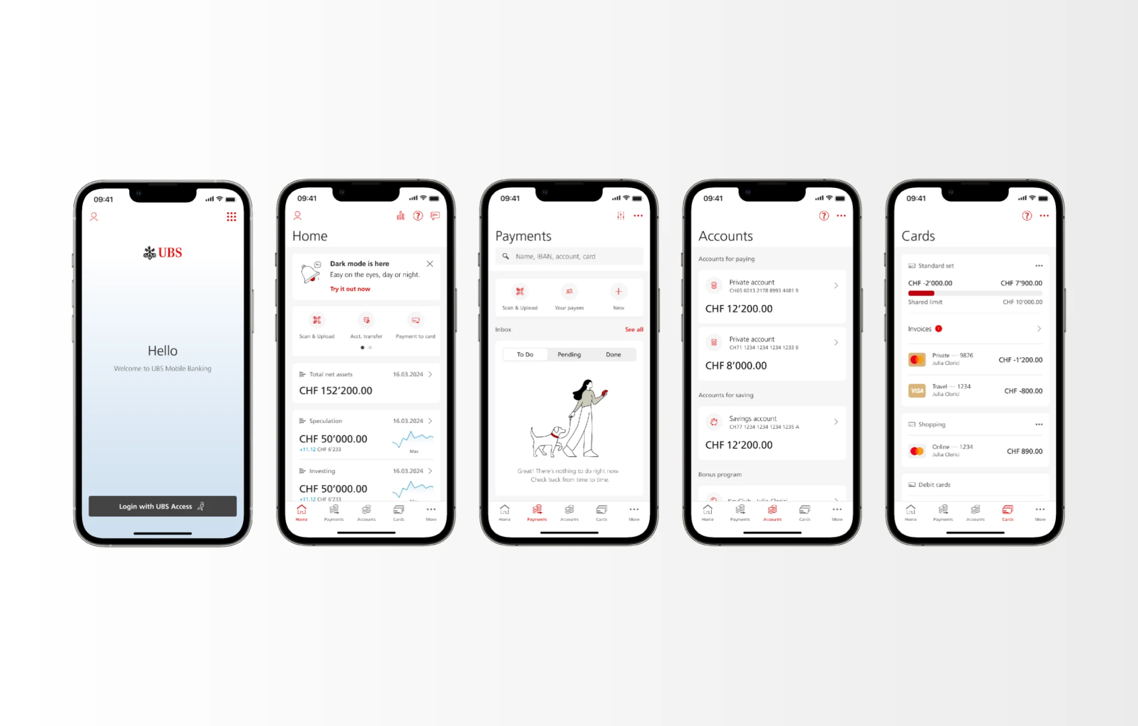
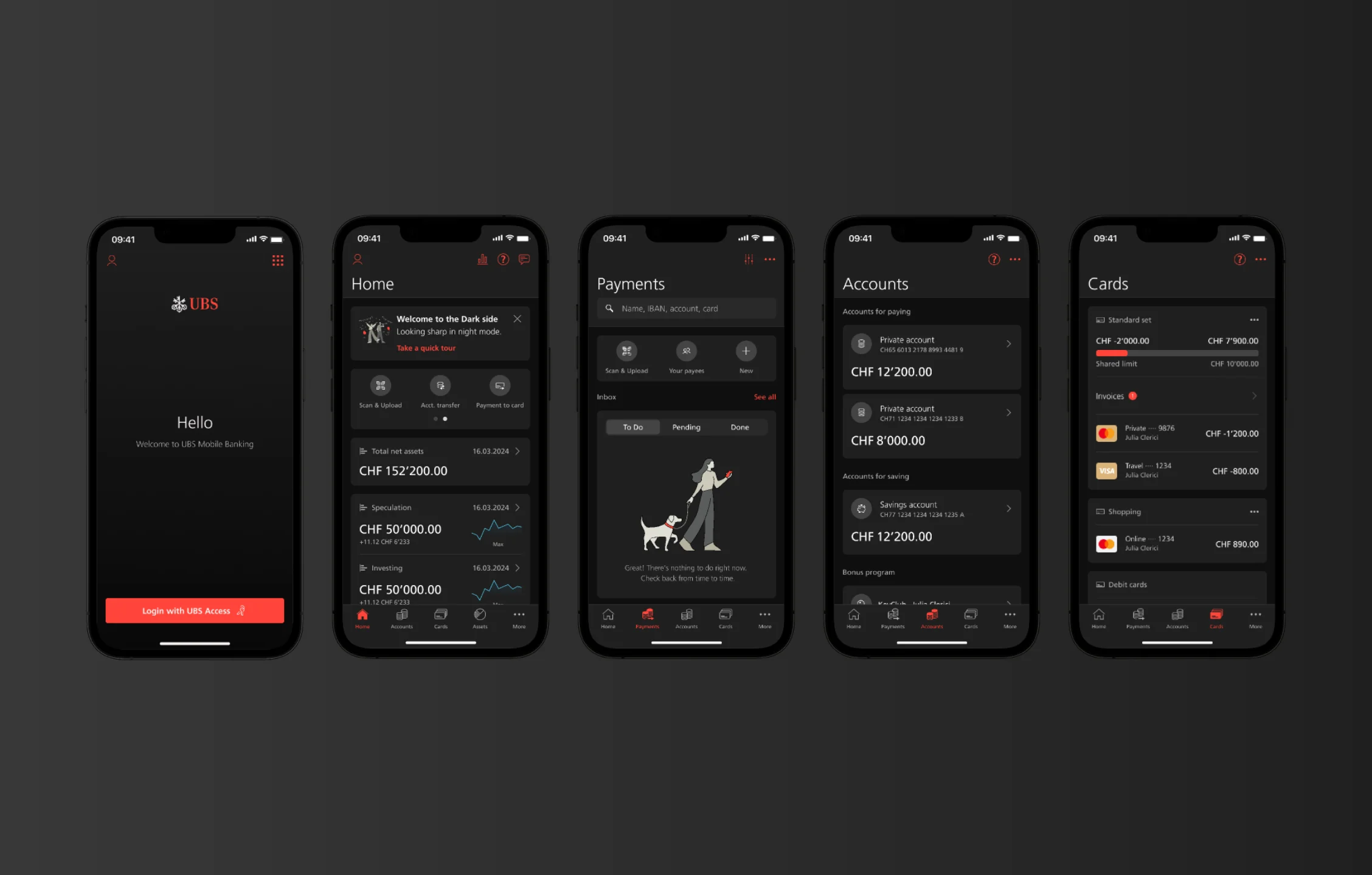
Our solution. The same screens in both modes. Nothing breaks, nothing jars.
IN THEIR WORDS
Users had been asking for years
“My experience was every time I went into the app at night I went blind, almost, because of the glaring white.”
“Why is there no Dark Mode, it burns the retina when using in the dark.”
“At night, the app resembles a flashlight.”
“Is there a dark mode? As someone who is sensitive to light, it would make my experience more comfortable.”
MY ROLE
Nobody handed me this. I picked it up
Sole designer on the project from the end of 2024. The brief was not assigned to me. I picked it up because it was sitting on the backlog and I was in a position to take it on. I ran it end to end: research, benchmarking, component audit, colour palette definition, and the full design system proposal, before bringing in the design system team, lead developers, and illustrators to validate and build the approach with me.
The scope was the full UBS mobile suite, with desktop to follow, and Twint considered throughout. Branding approval was a prerequisite before any business or development commitment. Getting there required a proposal robust enough to answer every concern that had caused previous attempts to fail. It was approved by branding, the design system team, and development by the end of 2025.
THE PROBLEM
No external convention to follow
Three problems had compounded each other, and together they explain why no previous attempt had succeeded. The first: dark mode at this level of brand specificity had no established guidelines. There were general approaches and principles, but nothing comprehensive enough to apply directly to a regulated banking product with a complex design system and a distinctive brand. A framework had to be built from scratch.
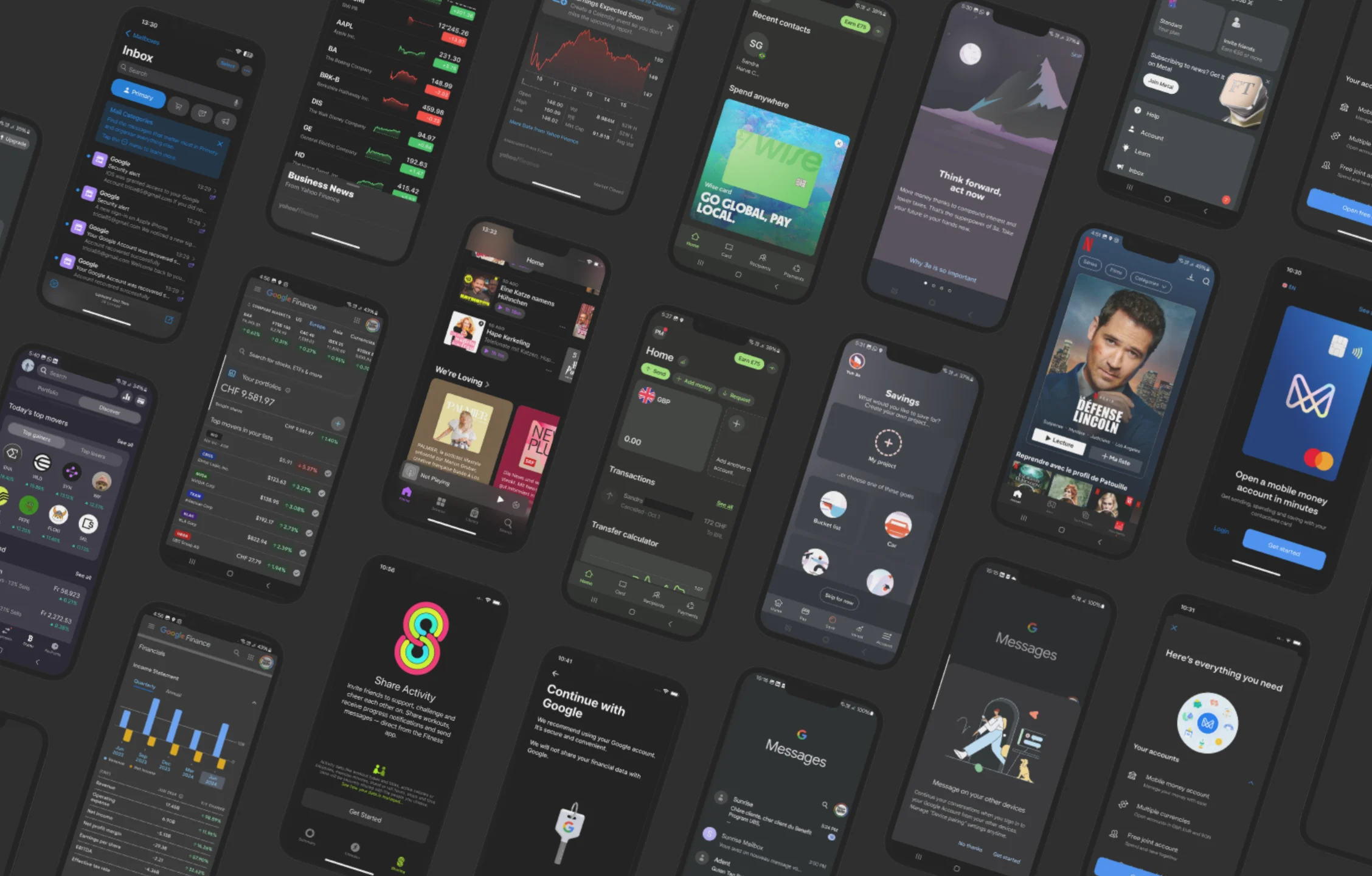
Benchmarking showed black and blue are the industry’s default choices for dark mode.
A fragmented design system
The UBS mobile design system runs on a main component library, but not uniformly. Many products, particularly those with complex data displays, custom journeys, and legacy components accumulated over years, had diverged from it.
A holistic rollout had to account for both the standard system and a wide landscape of bespoke implementations across charts, asset views, transaction histories, legacy journeys, third parties flows and financial data surfaces.
Red
The UBS brand is built on it. It is also one of the most difficult colours to carry into a dark environment while holding contrast for accessibility compliance and brand integrity. Previous attempts had failed precisely here: colour swaps that broke accessibility, or dark palettes that felt off brand. Neither problem had ever been solved together. As custodians of the bank’s identity, we had to find a red for dark mode that would not only pass WCAG green light, but also earn the branding team’s approval.
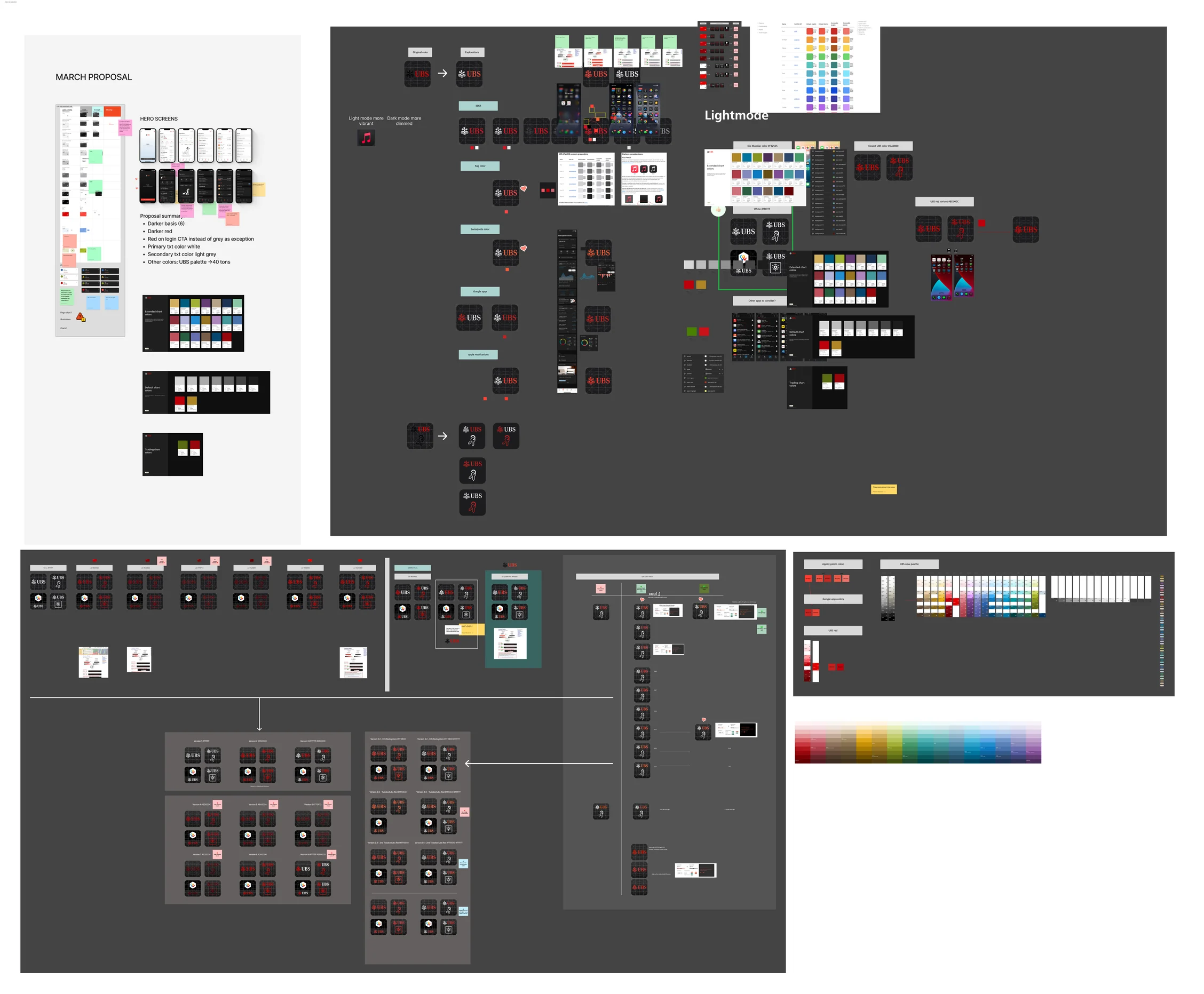
Extract of colour and contrast studies against WCAG thresholds.
THE DESIGN WORK
Not a colour swap. A system built for the dark.
The first decision was to reject the colour swap approach entirely. Every previous attempt had treated dark mode as a palette inversion. What was needed was a system built from the ground up: a colour palette designed for dark environments, derived from the UBS brand rather than adapted from its light mode values.
Colour system. The palette was developed component by component, each value defined for dark context rather than transposed from light. The central problem was red. I researched and identified a UBS aligned red that satisfies WCAG contrast requirements in dark environments while remaining recognisably on brand. This had not been achieved before at UBS. It became the anchor of the entire system.
Component audit. Every component in the design system was reviewed individually. Charts, asset displays, transaction lists, numerical tables: each required specific treatment. Where blanket rules could not apply without breaking legibility or visual hierarchy, deliberate exceptions were defined and documented. The goal was a system with clear principles and documented exceptions, not one with hidden inconsistency.
Illustrations. The UBS illustration style uses outline forms with red accents. In dark mode a direct adaptation of it failed visually. Rather than compromise, I worked with the UBS illustration team across multiple rounds to develop illustrations designed specifically for dark mode: not filtered or recoloured versions of existing artwork, but new pieces built for the environment. It extended the design system into a dimension it had never covered.
Design token architecture. After validating every component use case, semantic colour tokens were mapped across both modes, allowing consistent, automatic theming at component level. Once the token layer is in place, any designer on the team needs only a mode switch to work in dark mode. This was not a nice to have. It is what makes the system sustainable for every team that builds on it after delivery.
The complete proposal was validated with the design system team and lead developers before going to branding. Alignment across all three, the exact point where every previous attempt had broken down, was the condition for the project to move forward.
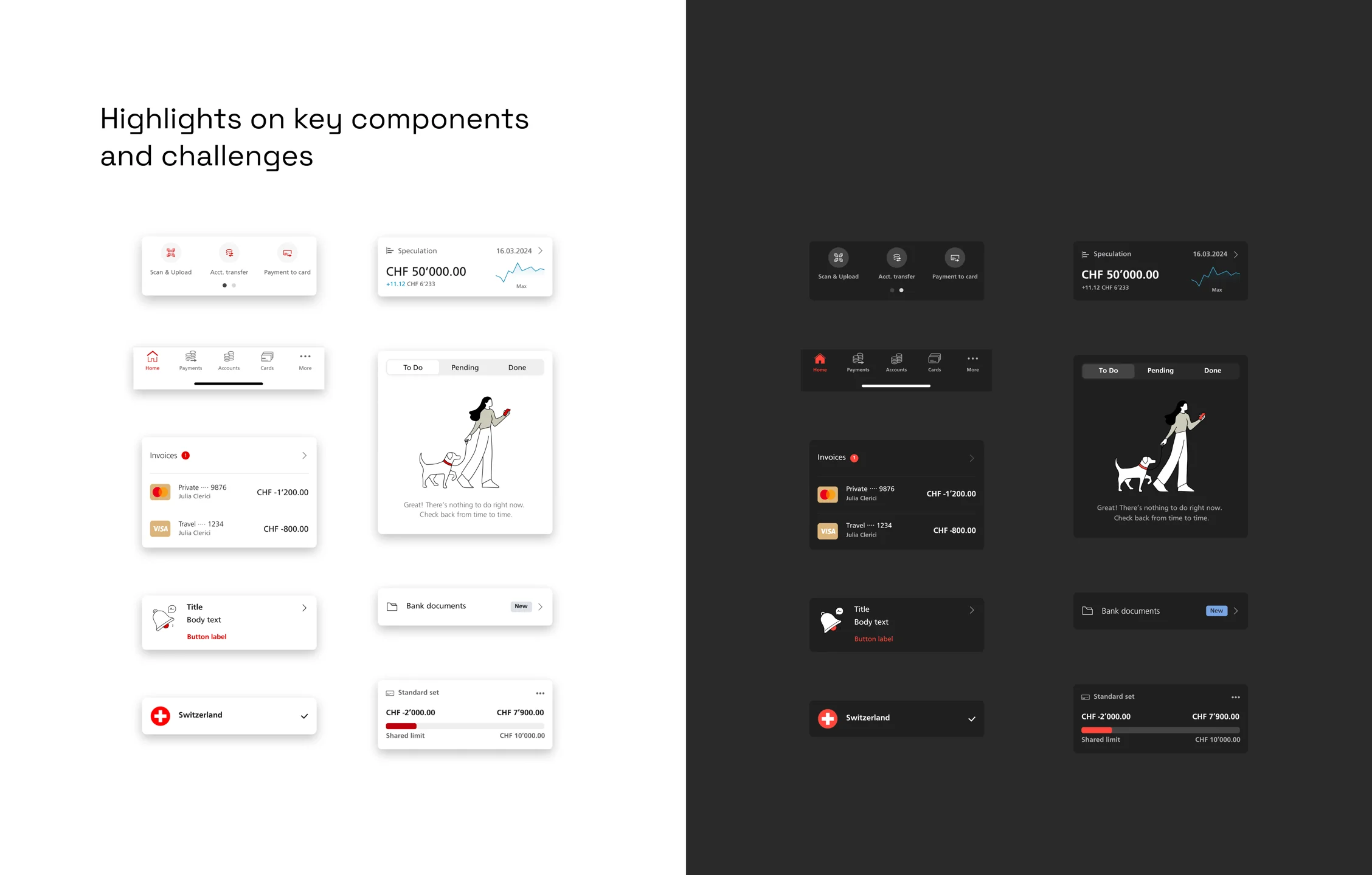
Examples of mobile components in light and dark, illustrating the challenges we had to face (progress bars, labels, icons, charts, etc).
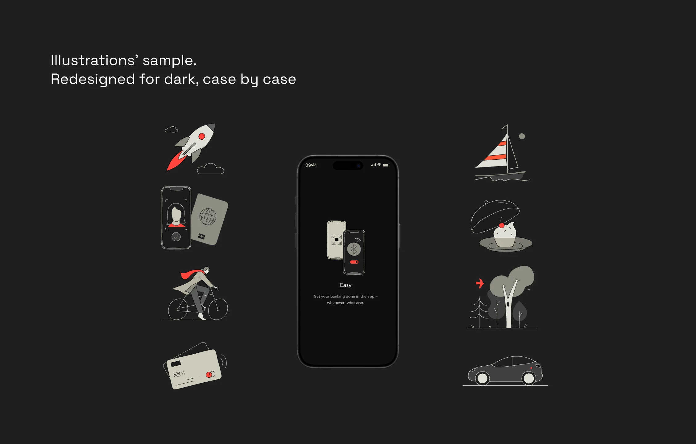
Illustration redesigns were done case by case, with a mixed approach of filled and outlined figures.
OUTCOMES
What was delivered
First dark mode proposal in UBS history to receive full approval from branding, design system, and development
Full mobile suite covered, with architectural consideration for desktop and Twint
A UBS aligned red that holds WCAG contrast in dark environments, solved for the first time at UBS
Illustrations redesigned specifically for dark mode, adding a layer the UBS design system had never had
A seamless mode switch enabled by token architecture: one toggle, every component, every surface, every illustration
A years long roadmap item unblocked, and several months of design system and development work saved by delivering a complete, validated proposal
WHAT MADE IT WORK
Not a simple switch
The project succeeded where previous attempts had not for one reason: it did not treat dark mode as a simple switch. It treated it as a design system problem that needed solving from the ground up. Getting branding, design system, and development aligned behind a single proposal, with no external precedent to reference and a brand colour that made the problem structurally harder, required systematic work that no shortcut could replace.
The standard was simple: switch modes, and nothing breaks, nothing jars, nothing looks approximated. The environment changes; the experience does not. That is what every previous attempt had failed to produce.
A note on status. The proposal was approved at the end of 2025 and scheduled to launch this year. That launch has since been postponed, and the design may not ship in its current form. The approval is what this case study is about. A framework, a palette, and a token architecture cleared branding, design system, and development at the first attempt, where every previous effort had stalled. That work is done and documented, whatever the roadmap does next.