UBS · CASE STUDY 01
UBS Mobile Payments
2.8 → 4.2
App Store rating, within the first year
4.4
CSAT, sustained over four years
71%
Satisfied or very satisfied users
11’306
Feedbacks in the launch year
CREW
Mobile Payments
ROLE
Sole Product Designer
TIMELINE
2020 to 2024
TEAM
1 PO, 1 BA, 12 developers (iOS and Android), 3 testers, 1 junior designer
CONTEXT
A product that existed, but not adopted by users
UBS Mobile Payments carried a 2.8 App Store rating and near zero mobile adoption in 2020, when I joined the team. On paper, the product had everything: complex journeys, dozens of payment types, heavily detailed sections built for compliance review, not human confidence. No analytics, no researcher, no design system. We built from scratch, with no data to guide us.
Desktop was the main focus at the time. I was part of a very small mobile team when I was asked to take over Mobile Payments. Payments is one of banking’s most used products, part of daily routine, yet deeply emotional. When it doesn’t work, the backlash is immediate and significant.
The backend was old and rigid, and the app ran on Cordova, which ruled out a natural, native experience. Turning a compliance heavy system that once felt like a chore into something people trusted enough to call effortless took relentless iteration. One piece of user feedback said it best: banking now ran like butter.
Four years later: 4.2 rating. CSAT 4.4 sustained across that period. A component library adopted firm-wide.
A UX feedback process adopted across the organisation. The CEO cited the redesign publicly in the NZZ after the first release.
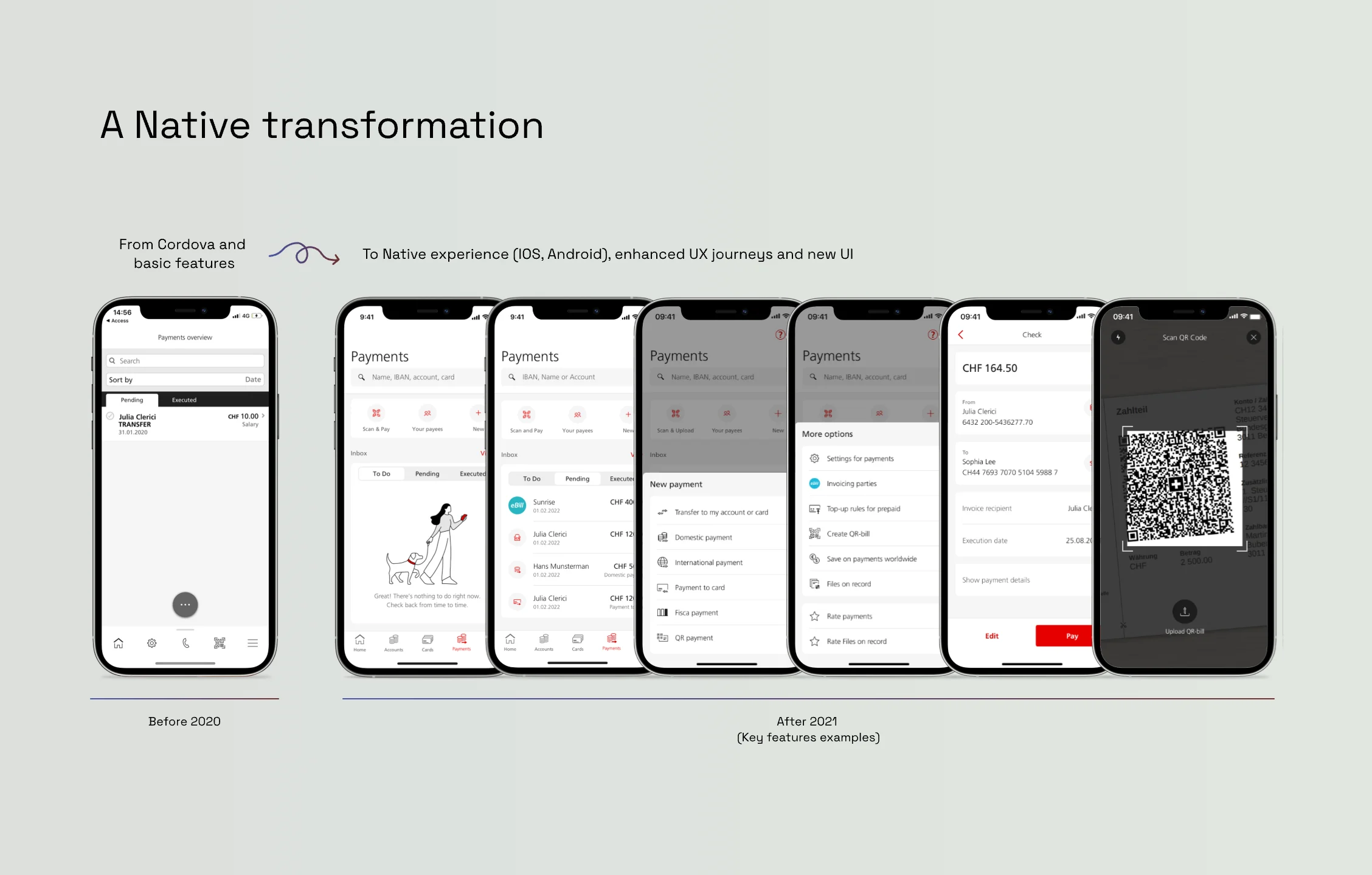
Mobile Payments transformation to Native.
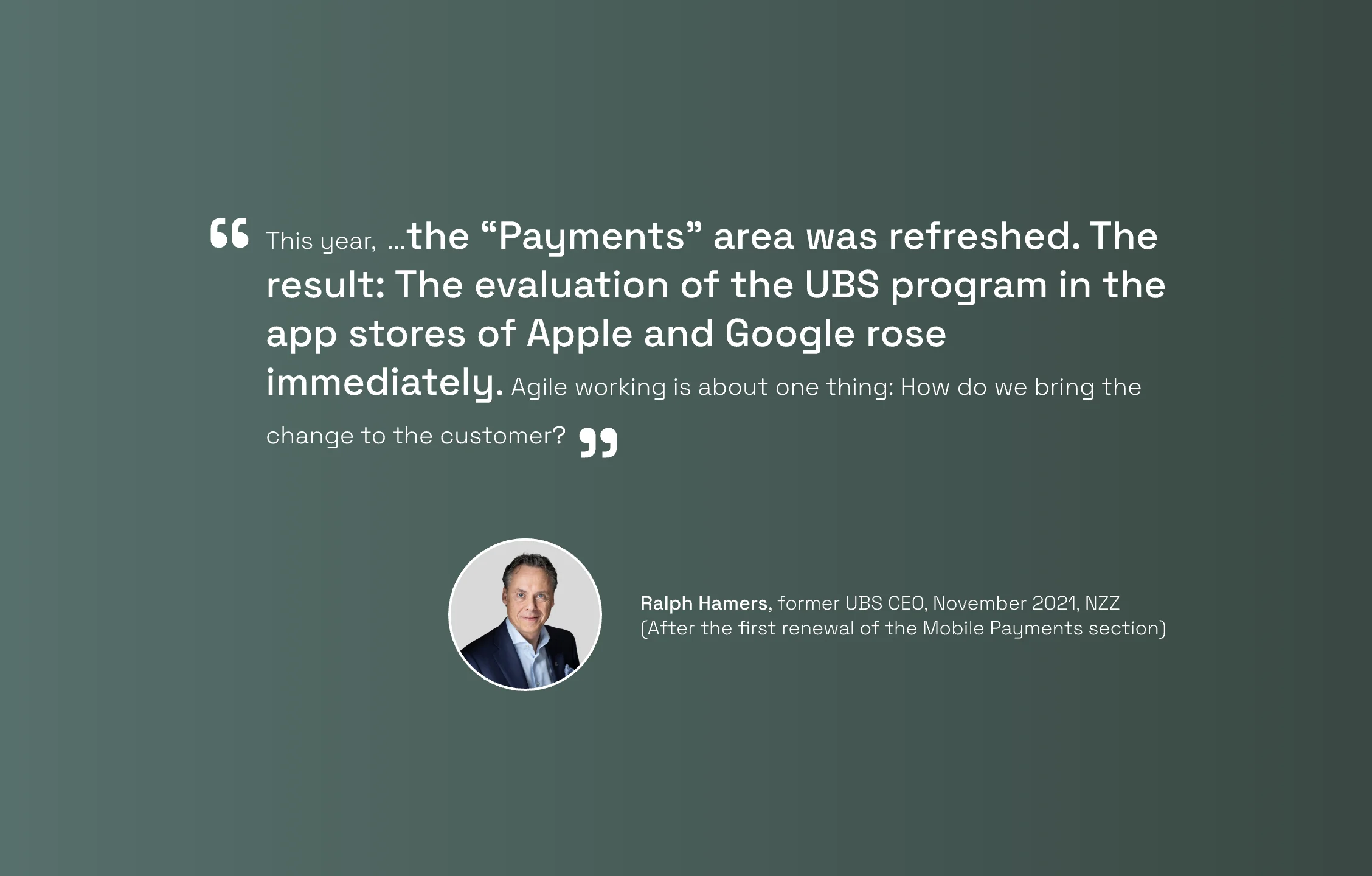
Ralph Hamers, then CEO of UBS, quoted in the NZZ, November 2021.
MY ROLE
Sole designer on the bank’s largest squad
Sole product designer for the bank’s largest cross functional squad: twelve developers across iOS and Android, three testers, one PO, one BA. I owned design for the mobile payments product end to end, delivering every feature the roadmap called for and resolving design debt. Many of the patterns I created, including list views, filtering, sorting, and summary screens, fed directly into the bank’s design system. I worked especially closely with my BA and PO, translating feature requests into design solutions that balanced business needs with technical constraints.
We went beyond simply executing on requests. I helped bridge design and IT, shaping the agile processes we ran as a team so design stayed embedded in every priority and decision. That process became a standard adopted across teams in the bank. I also ran grooming ceremonies as Scrum Master alongside the BA for a year. In the first year, before the team had a UX researcher, I ran all qualitative user testing myself, validating every major concept before it moved forward. I also mentored a junior designer who was promoted to Senior during this period.
THE PROBLEM
The backend dictated the experience, not the user
Every screen depended on multiple backend service calls just to load, leaving real time data and account information buried under heavy, cluttered loading states. Even after the native release, legacy screens built on Cordova lingered in the product, still holding back the experience. Where backend changes were possible, we requested them. Where they weren’t, design and IT teamed up on front end changes to work around the backend’s limitations, delivering the highest quality experience we could. The volume of requests we pushed eventually forced backend changes once thought impossible.
Complexity ruled where clarity should have
Dozens of payment types, colour coded with complex logic, buried in heavy banking jargon. No informational hierarchy, no distinction between what needed attention now and what had already been completed. Business and security teams treated dense, detailed pages as a requirement, and the result was navigation that confused rather than guided.
Friction replaced confidence at nearly every step; forms asked for information in the wrong order. Field validation was unclear and punishing. Labels used internal bank terminology instead of language users understood. Empty states were blank. The payment summary, the critical moment before money moves, was a data dump of backend parameters. Trust was absent at exactly the moment it mattered most.
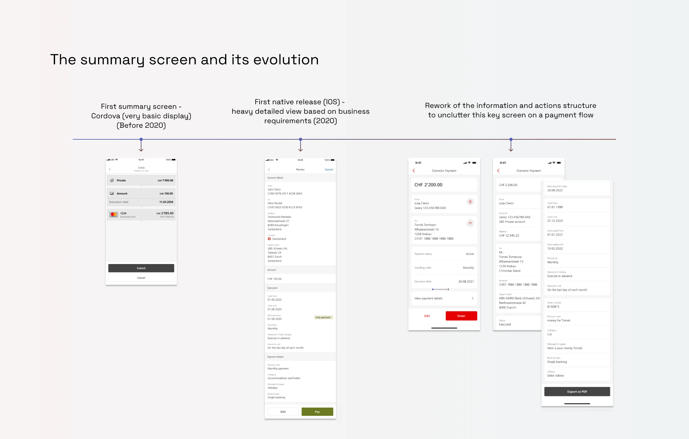
Three stages of the same screen: an early Cordova display, a heavy detail view shaped by business requirements, and the restructured version that followed.
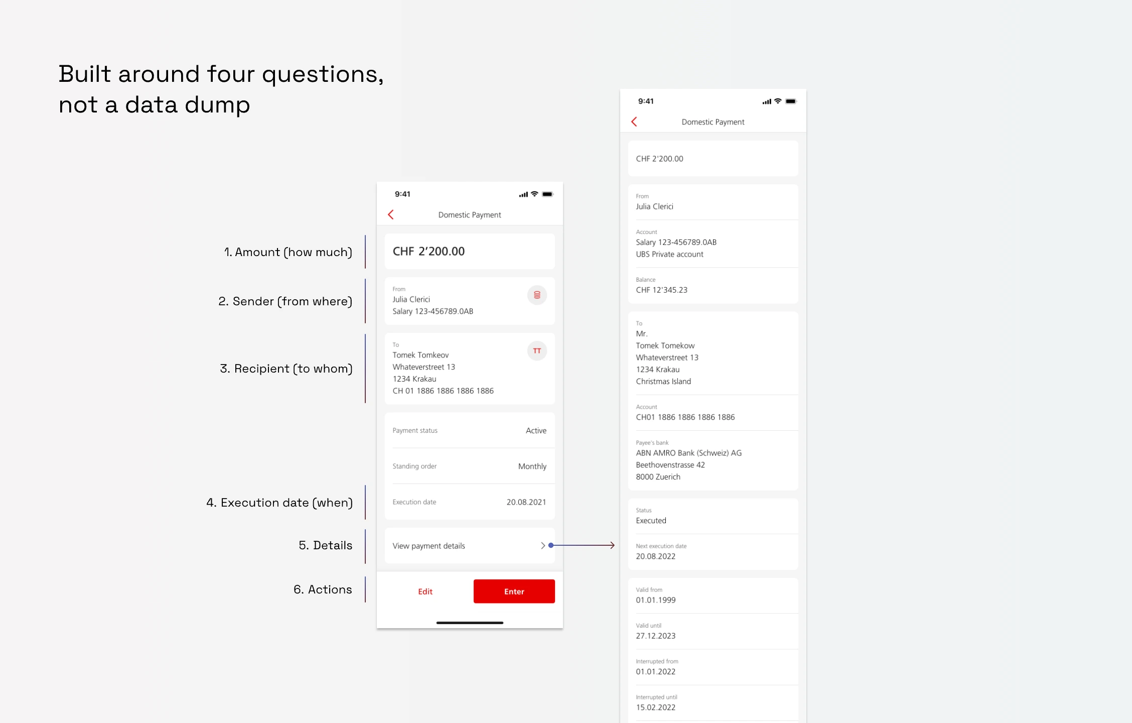
Fields reorganised around what actually mattered, amount, sender, recipient, execution date, with everything else moved into a separate, downloadable view. Actions rebuilt per payment type, replacing a single generic ‘more’ button.
Designed for iOS, retrofitted for Android
Android told a different story. No real native patterns existed, just iOS design retrofitted to fit, despite Android users making up a significant share of the bank’s mobile base. I was the only Android user on the design team pushing for change, until Android developers who felt the same gap joined in. Together we built a true native experience with Material Design, finally giving the product components it had never had.
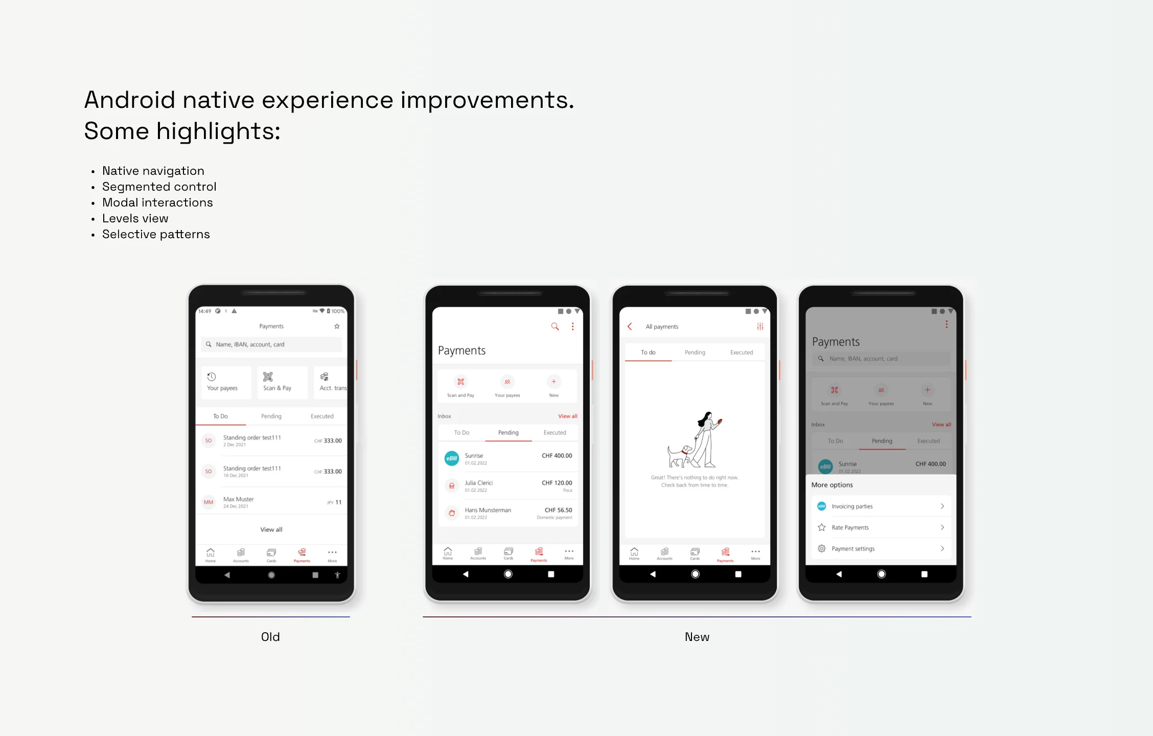
Native Android components, built with Material Design, replacing screens simply adapted from iOS.
THE DESIGN WORK
We didn’t inherit a process. We built one.
Every significant milestone went through real user testing, from early concept through to what we were about to ship, so we built the right thing from the start. With no data to guide us, we built a Feedback Form under Mobile Payments to collect that signal directly from users, now used across every UBS mobile product.
Every piece of feedback, from app store reviews to support tickets, was monitored and turned into actionable items, not just data, through a process I built with the PO and BA. UX findings fed directly into sprint planning.
Business, management, IT, and design reviewed every proposal together before it ever reached build, not as a formality, but because each side had something to challenge. That discipline is why every release went out with confidence, not hope. It wasn’t just a new process. It was a culture change, one other teams across the bank went on to adopt.
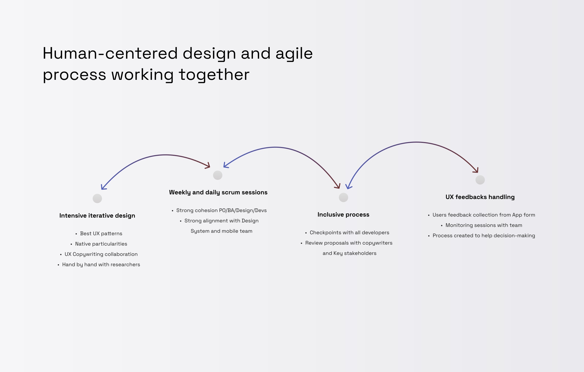
A process built to improve product quality and experience.
OUTCOMES
What changed
App Store rating: 2.8 → 4.2, within the first year of native launch
CSAT: 4.4, sustained over four years
71% of users satisfied or very satisfied, from 11’306 in-app feedbacks collected through the app in the launch year
Design patterns adopted by other UBS products: summary screens, filtering, forms, modal bottom sheet, promotional views, interactions, list views, validation fields, confirmation screens, complex search, currency display, Android components
“UX feedback loop” process adopted company wide
Junior designer promoted to Senior within the team after 4 years together
Total of 11’306 feedbacks collected over one year.
IN THEIR WORDS
Users put it directly
“Runs like butter. Banking from your pocket in seconds instead of hours at home.”
“So much improved over the last years. Someone is doing a good job.”
“Very practical and can be used anywhere.”
“Clear. Fast. Easy to use.”
“The app is exceptionally good and customer-friendly.”
“User friendly and comprehensive. Thank you.”
RECOGNITION
Presented as a success story
April 2022 · Invited to present Mobile Payments as a success story at the UBS CX&O Town Hall
June 2022 · Presented alongside Andrea Bargetzi, Head of Design (COE) at that time, as a case study to the Finance CAS cohort at HSLU Lucerne
Presented to UBS senior management as an example of product transformation led by design